
The Glass Box Mandate: Why the future of AI is "ugly."
Moving from the "Black Box" era to the "Audit" era of design.

There was no specific “lightbulb moment” where I realized we needed to change our design philosophy.
To be honest, I have simply never liked “Fancy UI.”
I have always preferred minimalism. Not the “Apple” kind of minimalism that hides everything behind a gesture, but the Data-Centric Minimalism of a financial terminal or a developer console. I prefer interfaces that respect the user enough to show them the raw data.
In the design world, there is an obsession with “seamlessness.” We are told to hide the plumbing. We are told that friction is the enemy.
But at Demand.io, we are building the opposite. We are redesigning our flagship product, SimplyCodes, to be intentionally denser, more complex, and visually “uglier” by consumer standards.
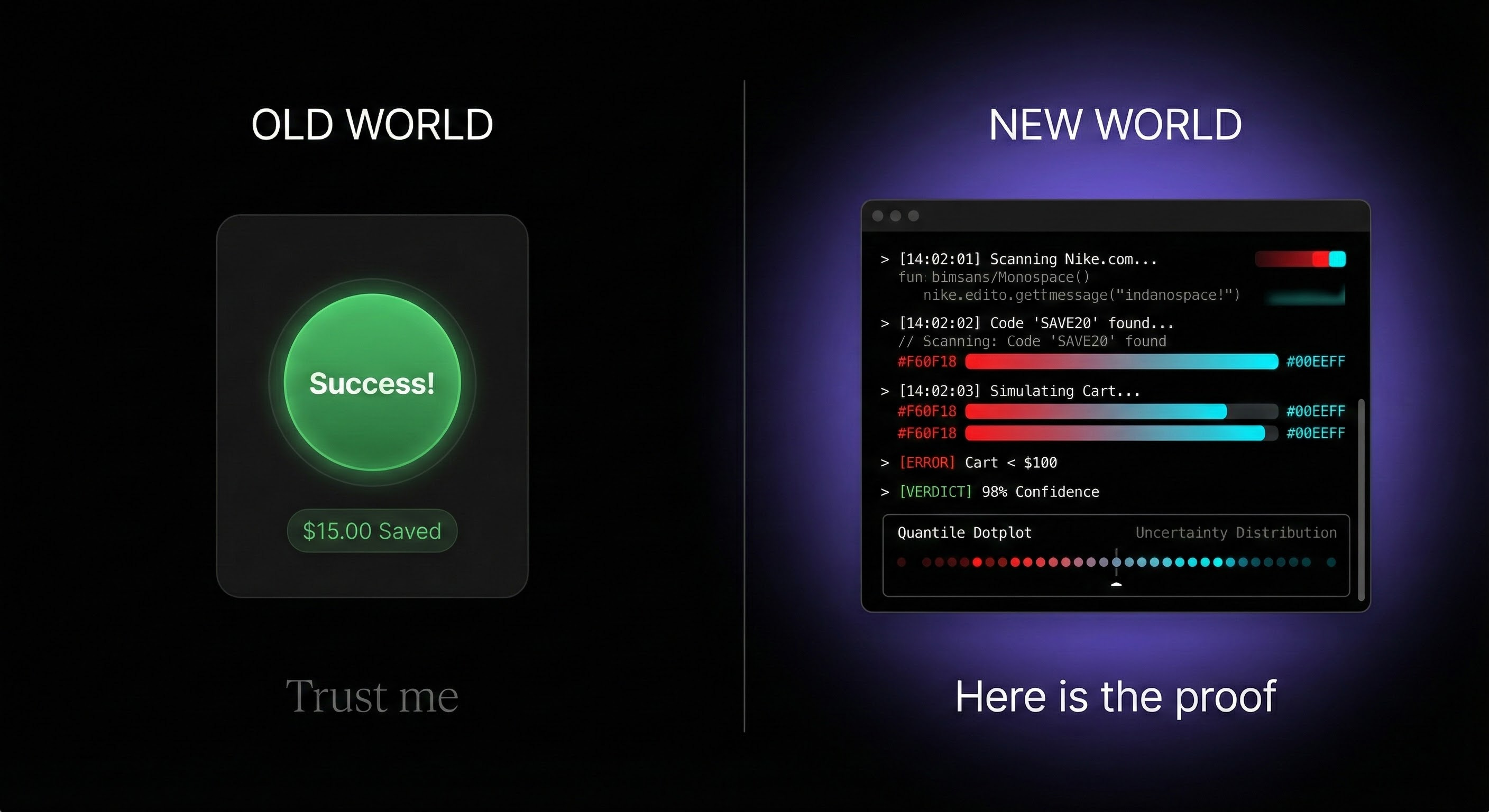
We are moving from the Black Box (Magic) to the Glass Box (Audit).
Here is the First Principles reasoning behind why we believe the future of AI interface looks less like a Chatbot and more like Google Finance.
The “FICO Score” for Commerce
When I explain our design direction to my team, I use a specific analogy: I want SimplyCodes to feel like the FICO score for coupons.
Think about what a FICO score represents. It isn’t “fun.” It isn’t “marketing.” It is a serious, data-backed audit of your financial reality. When you look at it, you aren’t looking for a “vibe”; you are looking for Truth.
In the world of online shopping, that “Official Source of Truth” doesn’t exist.
You have “Magic Buttons” that spin and say ”Trust us, you saved money.”
You have coupon sites cluttered with expired codes and SEO spam.
None of them offer an audit. They offer a guess.
This is why users suffer from Sucker Aversion. Even after a tool says “Success,” the user still opens a new tab to Google ”Nike promo codes.” They don’t trust the Black Box.
To solve this, we had to stop building a “Shopping Tool” and start building a Verification Engine.
The “Google Finance” Layer
Consider how you use Google Finance or Coinbase. You might only care about the top-line price, but you *trust* that price because you can see the depth below it. You see the charts, the volume, the bid/ask spread. The density of data is the affordance that signals: ”This is real.”
We are applying that same Data-Centricity to the checkout experience.
If you are shopping at Lululemon, and there are no codes, a “clean” app would just say nothing. A Glass Box app shows you the ledger:
”We scanned 5 major sources in the last 15 minutes.”
”Lululemon has not offered a site-wide code in 365+ days.”
”We flagged ‘SAVE50’ as suspicious/invalid.”
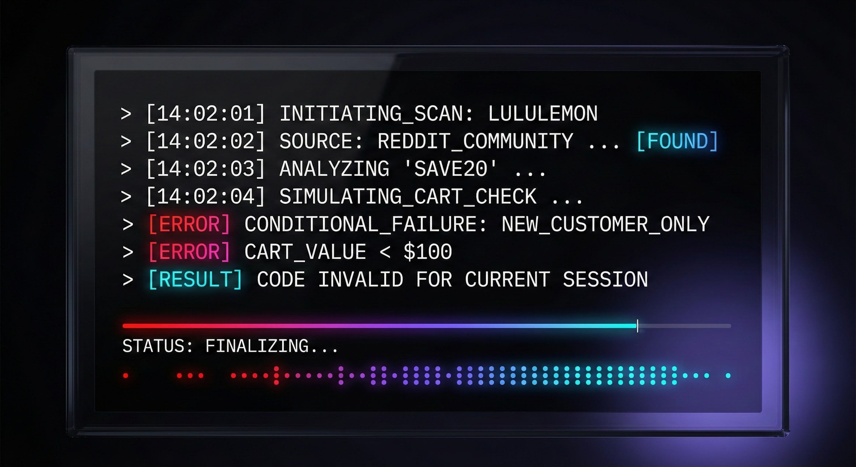
By exposing the **Failure Taxonomy**—the specific physics of *why* a code didn’t work—we aren’t just giving you a result; we are giving you Cognitive Closure. We are selling the end of the search.
Utility Polish vs. Marketing Polish
This requires a shift in aesthetic.
Marketing Polish is about persuasion. It uses gloss, gradients, and friendly copy to say, ”Please like me.”
Utility Polish is about function. It uses monospaced fonts, high contrast, and raw logs to say, ”Here is the work.”
We are stripping away the illustrations and the marketing fluff. We are replacing “Magic Badges” with Quantile Dotplots that visualize our confidence levels.

To a marketer, this looks “ugly.” To a 10x Operator or a savvy consumer, it looks like a tool they can actually use.
The Bet on Auditability
As we enter the Agentic Era, the internet is about to be flooded with AI-generated noise. In that environment, **Trust** becomes the scarcest asset.
And trust is a costly signal. You cannot generate it with a “Seamless” UI. You can only generate it by showing your work.
We aren’t building a magic wand. We are building the audit log.